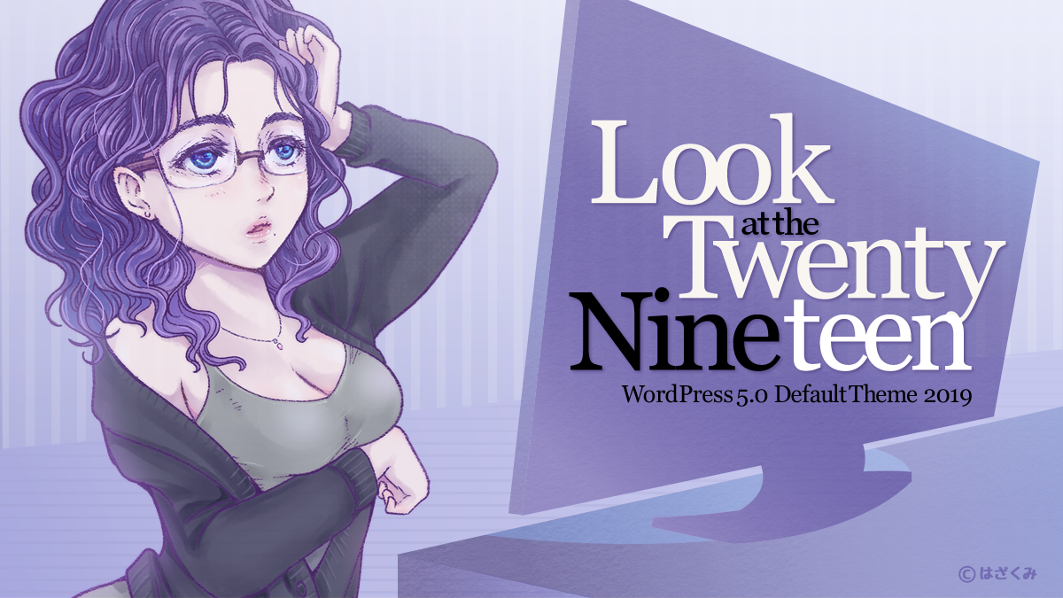
いよいよ WordPress5.0 のリリースが近づいてきました。WordPress5.0では新しいデフォルトテーマ「Twenty Nineteen」が搭載される予定です。
「Twenty Nineteen」は アンダースコアズ・_s(underscores Automattic製) と gutenberg-starter-theme をベース作られていて 新しいエディタ「Gutenberg(グーテンベルク)」対応になっています。
現在「Twenty Nineteen」は WordPress5.0 RC2 でテストしています。
まだ、開発中ですので今後 変わっていくと思いますが「Twenty Nineteen」をチェックしていきたいと思います。
外観
IE11ではいろいろダメダメでした、
標準の font-size は 22px でした。
コンテンツ部分
1カラムになっています。サイドバーはありません。
コンテンツ部分内は ブラウザ画面 の幅を 12等分して その 6個分の幅で表示されるようになっています。
この方法は「幅広」「全幅」に対応する為だと思われます。
/* !Block styles */
.entry .entry-content > *,
.entry .entry-summary > * {
	margin: 32px 0;
	max-width: 100%;
}

@media only screen and (min-width: 768px) {
	.entry .entry-content > *,
	.entry .entry-summary > * {
		max-width: calc(8 * (100vw / 12) - 28px);
	}
}

@media only screen and (min-width: 1168px) {
	.entry .entry-content > *,
	.entry .entry-summary > * {
		max-width: calc(6 * (100vw / 12) - 28px);
	}
}
Content部分の余白(左右マージン) は 768px で 変化するようになっています。
.entry .entry-content,
.entry .entry-summary {
	max-width: calc(100% - (2 * 1rem));
	margin: 0 1rem;
}

@media only screen and (min-width: 768px) {
	.entry .entry-content,
	.entry .entry-summary {
		max-width: 80%;
		margin: 0 10%;
		padding: 0 60px;
	}
}
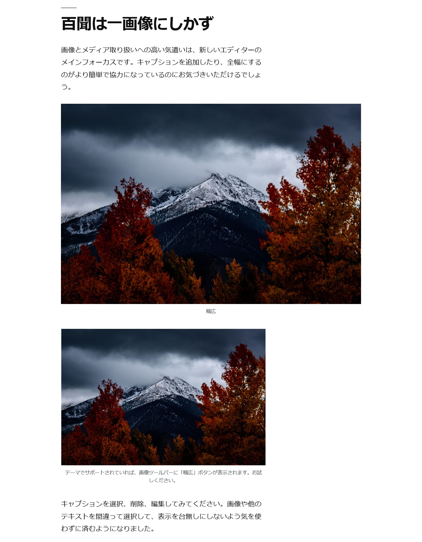
「Gutenbergブロックエディタ」で「幅広」設定した画像では Content部分いっぱいに表示するようになっています。
@media only screen and (min-width: 768px) {
	.entry .entry-content > *.alignwide,
	.entry .entry-summary > *.alignwide {
		width: 100%;
		max-width: 100%;
	}
}
「Gutenbergブロックエディタ」で「全幅」設定した画像では 画面いっぱい で 表示されるようになっています。
.entry .entry-content > *.alignfull,
.entry .entry-summary > *.alignfull {
	position: relative;
	left: -1rem;
	width: calc( 100% + (2 * 1rem));
	max-width: calc( 100% + (2 * 1rem));
	clear: both;
}

@media only screen and (min-width: 768px) {
	.entry .entry-content > *.alignfull,
	.entry .entry-summary > *.alignfull {
		margin-top: calc(2 * 1rem);
		margin-bottom: calc(2 * 1rem);
		left: calc( -12.5% - 75px);
		width: calc( 125% + 150px);
		max-width: calc( 125% + 150px);
	}
}
レスポンシブ
レスポンシブでのブレイクポイントはこの2つだけになっています。
@media only screen and (min-width: 768px) {}
@media only screen and (min-width: 1168px) {}
※現在は 1168pxより大きい場合は 6/12 になっています。
@media only screen and (min-width: 1168px) {
	.entry .entry-content > *,
	.entry .entry-summary > * {
		max-width: calc(6 * (100vw / 12) - 28px);
	}
}
これでは 右に余白がつきすぎて ムムッ な感じになっています。
※「幅広」との違いをだす為にこうしてると思われます。
気持ち悪い場合は 子テーマ作成時に 以下のコードでオーバーライドします。
@media only screen and (min-width: 1168px) {
	.entry-content > *,
	.entry-summary > * {
		max-width: calc(8 * (100vw / 12) - 28px);
	}
}
※しかし「幅広」の意味がなくなります。
コンテンツ幅
コンテンツ幅は 開いているブラウザ画面幅を元に決められていますので(変化しますので) $GLOBALS[‘content_width’] を設定する事は意味がなくなってるようですが、設定では content_width は 640px になっています。
※This variable is intended to be overruled from themes.
function twentynineteen_content_width() {
	// This variable is intended to be overruled from themes.
	// Open WPCS issue: {@link https://github.com/WordPress-Coding-Standards/WordPress-Coding-Standards/issues/1043}.
	// phpcs:ignore WordPress.NamingConventions.PrefixAllGlobals.NonPrefixedVariableFound
	$GLOBALS['content_width'] = apply_filters( 'twentynineteen_content_width', 640 );
}
add_action( 'after_setup_theme', 'twentynineteen_content_width', 0 );
埋め込み系(動画等)の 生成時では content_width を元に iframe の幅を設定されていますので ブラウザ画面幅が広い場合は 物足りなくなってしまっています。
気になる場合は フィルターを使って content_width を再設定するとか CSS追加で 埋め込み系(動画等)の表示幅を調整する必要がでてきます。
ヘッダ
ヘッダ画像は「Twenty Seventeen」のように 画面いっぱいで表示するようになっています。
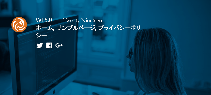
またヘッダ画像は 投稿(固定ページ)ごとに アイキャッチ画像 を使っていますので 設置する場合は大きな画像が必要です。
トップページではヘッダ画像を設定するところはありません。
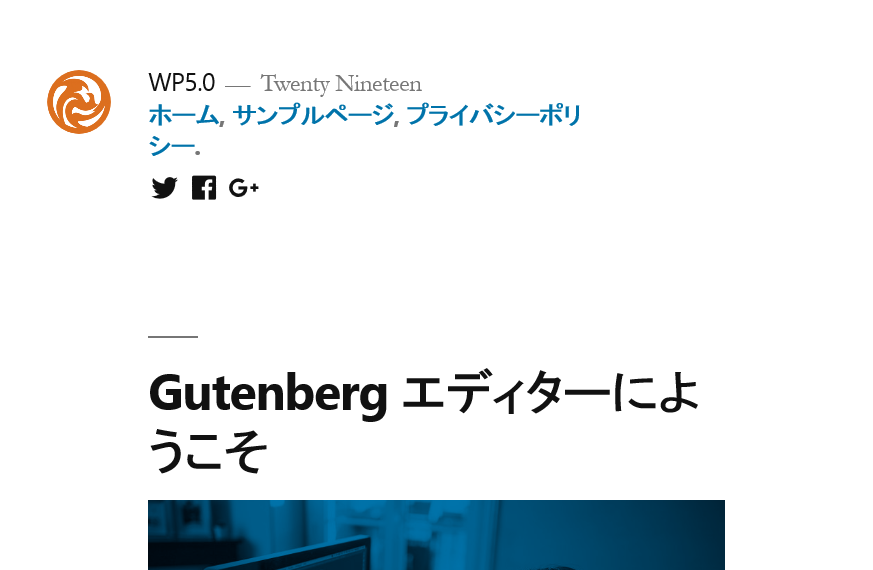
トップページで ヘッダ画像を表示したい場合は「設定→表示設定 のホームページの表示」で アイキャッチ画像を登録した固定ページを設定する事になります。
※固定ページのタイトルが入りますので不要な場合はタイトルは空欄にしてください。
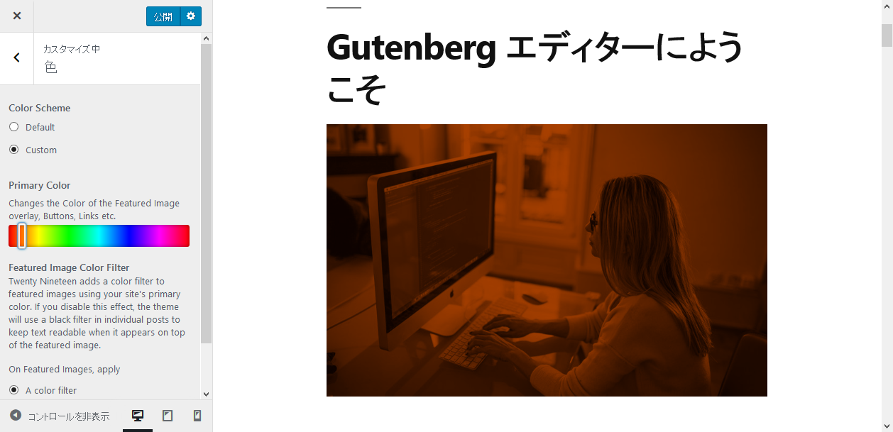
画像自体はCSSのbackgroundで設置されて さらにグレースケールにフィルターされ 背景色と混合モードで表示するようになっています。
背景色を変更したい場合はカスタマイザーで変更できるようです。
ウィジェット
ウィジェットエリアはフッターウィジェットだけです。
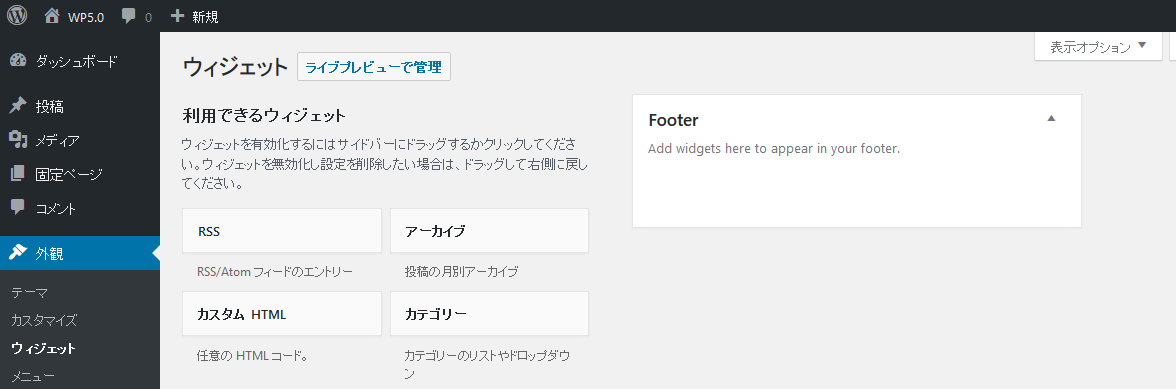
ここは2列で表示されるようになっています。
※カスタマイザーでも設定ではます。
サイドバーがありませんので コンテンツ内でウィジェットを使いたい場合は
従来のウィジェット(アーカイブ・カテゴリ・最新の記事・最新のコメント) は「Gutenberg(グーテンベルク)」でブロックで設置できるようになっていますのでそれを使う前提になっているようです。
現状では他のウィジェットを使いたい場合は ウィジェットをブロック化したプラグインを探すか
ウィジェットをショートコード化 して使えるプラグイン「Widget Shortcode」を利用すれば 「Gutenberg(グーテンベルク)」で ショートコードとしてウィジェットを使えるようにできます。
メニュー
メニューは3種類あります。
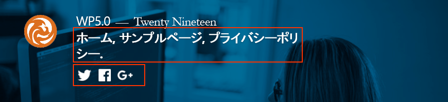
「Primary」は従来通りで「Social Links Menu」はSNSへのリンクを設定するとアイコン表示されます。
「Footer Menu」は フッタ部分の一番下に表示されます。
※カスタマイザーでも設定ではます。
コンテンツのオプション
カスタマイザーで「コンテンツのオプション」を設定できます。
ブログ表示
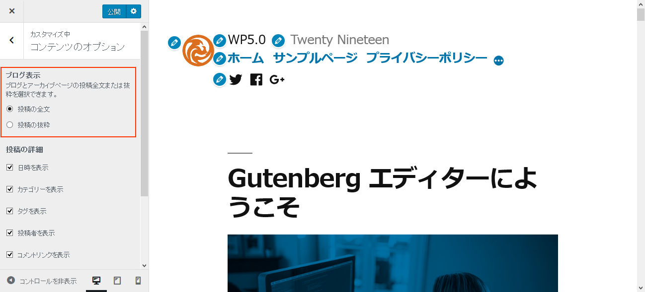
トップページやアーカイブ(投稿一覧)で コンテンツを全部表示か抜粋(一部だけ)表示にするかを設定できます。
投稿の詳細
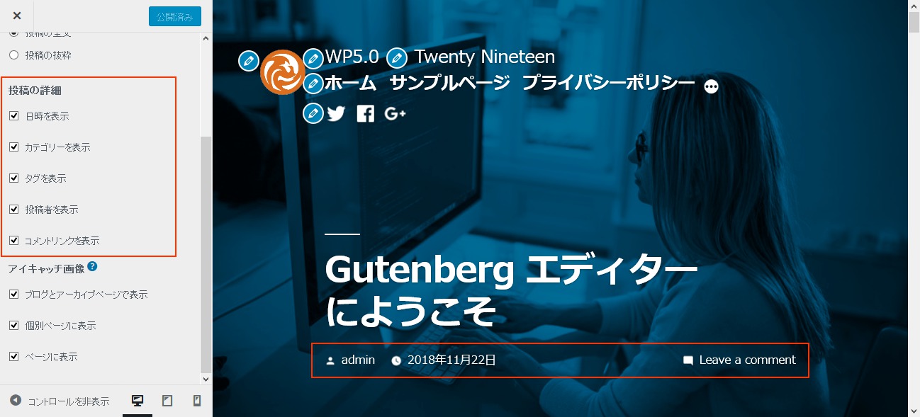
投稿ページに表示される ヘッダ側とフッター側に表示される副情報を表示/非表示できます。
アイキャッチ画像
それぞれのシーンでアイキャッチ画像を表示するかどうかを設定できます。
□ブログとアーカイブページで表示
トップページやアーカイブ(投稿一覧)で タイトル下に表示させるかどうかを設定します。
□個別ページに表示
□固定ページに表示
ヘッダに表示させるかどうか設定します。
テンプレート
テンプレートはシンプルになっています。
サイトシーンによるテンプレート読込
| トップ | 投稿 | 固定ページ | アーカイブ | カテゴリ/タグ | サイト内検索 | 404 | アタッチメント | |
| index.php | ○ | |||||||
| single.php | ○ | |||||||
| page.php | ○ | |||||||
| image.php | ○ | |||||||
| archive.php | ○ | ○ | ||||||
| search.php | ○ | |||||||
| 404.php | ○ | |||||||
| header.php | ○ | ○ | ○ | ○ | ○ | ○ | ○ | ○ |
| footer.php | ○ | ○ | ○ | ○ | ○ | ○ | ○ | ○ |
リリースまでに更新された部分は、また追って追記していきたいと思います。
参考
WordPress 5.0 Beta 5
https://wordpress.org/news/2018/11/wordpress-5-0-beta-5/
Introducing Twenty Nineteen
https://make.wordpress.org/core/2018/10/16/introducing-twenty-nineteen/
twentynineteen – Github
https://github.com/WordPress/twentynineteen
_s(Automattic) – Github
https://github.com/Automattic/_s/
gutenberg-starter-theme – Github
https://github.com/WordPress/gutenberg-starter-theme
Widget Shortcode
https://ja.wordpress.org/plugins/widget-shortcode/
テーマ を Gutenberg に対応させる時、最低限やっておく事 – ねんでぶろぐ
https://nendeb.com/741